
Container Queries Movie Theater - by Amit Sheen
For a long time I’ve wanted to do something with container queries (Let’s call them CQ from now on). CQ are great, they’re the CSS neutral evolution into component based development, with tons of good practical uses, and it’s changing the way we write our CSS, specifically layouts.
So I thought about what ‘layout’ would be fun to play around with, but I didn’t find any good ideas. until one day the guys from the Fronteers Conference announced that their next event will be in a movie theater. Now, that is a great idea!
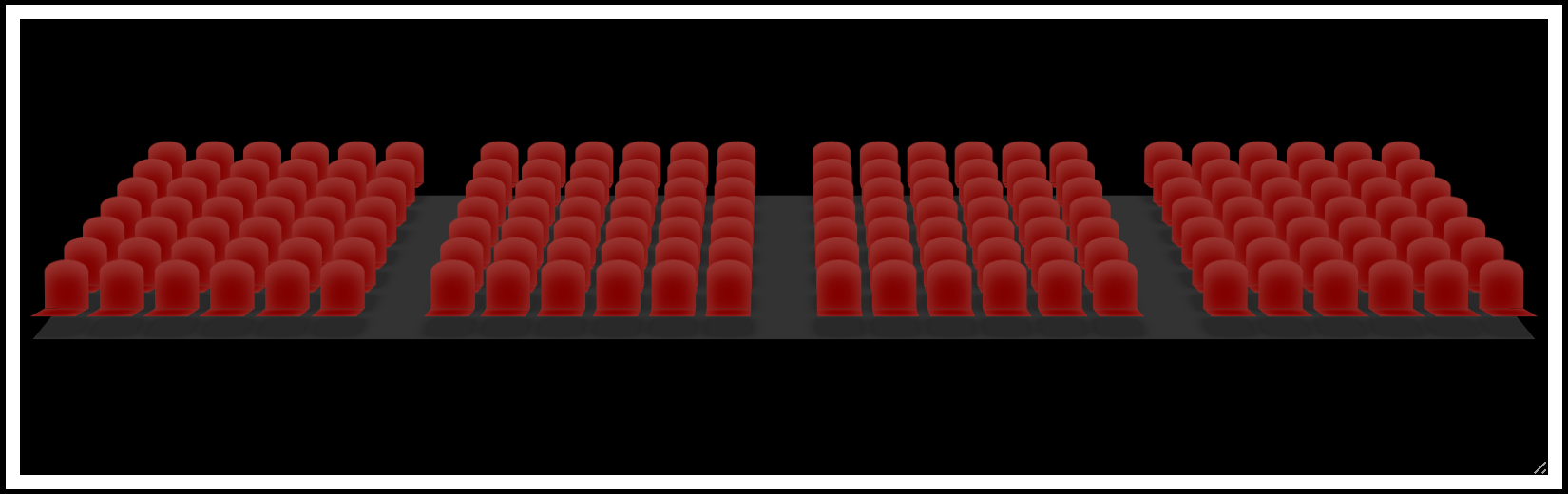
Let’s build a ‘dynamic movie theater’, where the theater is the container, and the layout (the rows, seats, aisle) are set by the size of the theater. We’ll focus on the CQ part, but don’t worry, later we’ll add perspective, animations, and some 3D stuff. Really, here’s the end result:
Step 1: The Container
First thing first, our container, the theater. We’ll start be adding a simple <div> with a class of “theater-container”, and add some basic CSS:
.theater-container { width: 300px; height: 200px; border: 5px solid #fff; container-type: inline-size; container-name: theater; overflow: hidden; resize: horizontal; }Besides the basic width, height and border, we’ve added 2 properties which declare this element as a containment context, and turn it into a container that we can query by.
- a
container-typethat creates the containment context and lets you specify if you just want to query the width (inline-size) or both the width and the height (size). - a
container-namethat will be used in the@containerquery. If not provided, the styles will be applied based on the nearest ancestor with a containment context.
These properties can also by written as a shorthand, like so:
container: theater / inline-size;
A third property we need is overflow. Now that we’re querying the size of the container, and might change the size of the children accordingly, we must add an overflow: hidden; to the container (or scroll), so that the container size won’t be affected by the size of its children. Otherwise we may find ourselves in a recursive loop where the container affects the children and vice versa. (MDN overflow)
And we’ve also added the resize property, just for our demo, so we can easily play around with the size of the container. We can set it to horizontal if we only want to resize the width, or to both for resizing the width and height. (MDN resize)
Step 2: The Theater
Now that we have our container, we can start working on the seats layout. Our theater element, just like a real theater, is divided into rows, and each row is divided into seats. For this demo, let’s say that the most rows our theater can have is 16, and each row has a maximum of 24 seats.
So let’s add a theater div with 16 rows in it, and 24 seats in each row (the easiest way is with Emmet, just type in .theater>.row*16>.seat*24 and tab), and add the styles for each element:
- The
.theaterelement contains the rows, so we’ll give it adisplay: flex;with aflex-directionofcolumnso that the rows are one on top of the other, and agapof$rowsGapto space out the rows. - Each
.rowcontains the seats, so we’ll also give them adisplay: flex;, withjustify-contentto keep things centered, and add agapof$seatsGapbetween the seats. - Lastly, we’ll set the size of each
.seatwith awidthof$seatSizeand aheightof$rowSize, and add a red color so we can see it.
- Note: I’m using SCSS variables and not custom-properties for a few reasons. 1, these numbers are meant to be constants and not to be changed in runtime. 2, we’ll use some SCSS loops to simplify our code, and it will be easier with SCSS variables. and 3, the support for querying a custom property is not here yet, so we need to pre-render
pxvalues.
At this point, you can already ‘grab’ the bottom right corner of the white frame and play around with the size of the container, but we don’t get the result we want, yet. Yes, the rows ‘kind of’ disappear when we resize the height, but they’re still there. We want the number of rows and seats to fit comfortably inside the theater, so we need to ‘remove’ rows and seats according to the container size. Now is the turn of CQ, and we’ll start with the rows.
The number of rows is affected by the height of the container, so we need to query the height and calculate which rows to show and which to hide. let’s take a look at the first CQ and break it down:
@container theater (#{$rowSize * 1} <= height < #{$rowSize * 2 + $rowsGap * 1}) { .row:nth-child(n + 2) { display: none; } }We have the @container query followed by the name of the container (theater) and then the condition. That means, just like a regular @media query, that if the condition is true, then the style inside will be applied. The first condition is - If the height of the container is larger (or equal) to one row size AND less the 2 rows plus the gap. That means that if there’s only room for one row, we need to hide every row starting from the 2nd row. we’re selecting the rows using the :nth-child(n + 2), and hiding them using display: none;
That’s one query, and the rest of the queries are actually very similar. In fact, if we look at the next two queries, we might find a pattern…
@container theater (#{$rowSize * 2 + $rowsGap * 1} <= height < #{$rowSize * 3 + $rowsGap * 2}) { .row:nth-child(n + 3) { display: none; } } @container theater (#{$rowSize * 3 + $rowsGap * 2} <= height < #{$rowSize * 4 + $rowsGap * 3}) { .row:nth-child(n + 4) { display: none; } }The second query condition checks the height and is true if there’s space for two seats, the third condition is true when there’s space for three, and so on. As we can see, the numbers (highlighted) just increase in one on each iteration, and since we know we have a max of 16 rows, we can easily turn this into a simple loop to run 16 times, increasing each value by 1 each time.
@for $i from 1 through 16 { @container theater (#{$rowSize * $i + $rowsGap * ($i - 1)} <= height < #{$rowSize * ($i + 1) + $rowsGap * $i}) { .row:nth-child(n + #{$i + 1}) { display: none; } } }Now let’s set the min and max height of the container, so that we won’t query the theater when we don’t need to. The min-height is one row, so is the height of one row, and and max-height is the max number of rows times the height of each row, plus the gaps, like this:
.theater { min-height: $seatSize; max-height: $maxRows * $seatSize + ($maxRows - 1) * $rowsGap; }As for the seats, we can do pretty much the exact same thing, with some changes - we need to loop 24 times and not 16, use the $seatSize and $seatsGap instead of the row constants, and select the .seats elements. we’ll also add a min-width and a max-with, just like the height. So now we have this:
- Tip: I encourage you to open this pen in CodePen’s Editor and click on ‘View Compiled CSS‘ to see how these loops were rendered. It will give you a better grasp of how SCSS loops work and what the browser actually gets.
Now when we resize the size of the container we can see that rows and seats are appearing and disappearing according to the right width and height. So far so good, but about aisles?! Well, here’s where things get interesting.
Step 3: The Aisles
We’ll begin by adding just one aisle, and to make things simple for ourselves, we’ll make the aisle the same size as an empty seat, so every time we want to add an aisle we just ‘skip’ a seat.
We want the aisle to appear when we have more than 6 seats in a row. That means that when we have space for 6 seats we’ll have 6 seats, but if we ‘size-up’ our container to have space for 7 seats, we’ll add an aisle instead of a seat, and add the 7th seat only when we have space for 8 seats.
Luckily, we already have a loop that query the width of the container, and we can use it to add the logic and style we need to the proper seats. So inside the second loop, we’ll add a new variable called $aisleCount, set it to 0 as a default, and add a small condition: if the number of spaces is greater than (or equal to) 7, the $aisleCount is set to 1;
$aisleCount: 0; @if (7 <= $i) { $aisleCount: 1; }We can now subtract this value from our .seat:nth-child selector, so we’ll skip a seat if there’s an aisle in the layout.
.seat:nth-child(n + #{$i + 1 - $aisleCount}) { display: none; }Of course, skipping a seat doesn't mean we want one less seat in our layout. We want to keep the $maxSeats value, so we need to change the loop count from 24 to 25 to account for the aisle, and add the $aisleSize to the container’s max-width.
max-width: $maxSeats * $seatSize + ($maxSeats - 1) * $seatsGap + 1 * $aisleSize;
So far for the seats, now let’s add the aisle itself. Inside our new condition we’ll select the ‘middle’ seat by using floor($i / 2) as the :nth-child value, and add a margin in the size of the aisle.
.seat:nth-child(#{floor($i / 2)}) { margin-inline-end: $aisleSize; }Put it all together, and we have an aisle.
To add 2 and 3 aisles we’re using the same logic, but this time we’ll use 3 conditions: if (7 <= $i and $i < 14) we’ll have one aisle, if (14 <= $i and $i < 21) then we’ll have two, and if (21 <= $i) we’ll add three aisles. We’ll then select the right seats in each condition to add the margin to, and that’s it.
Step 4: The Perspective
Up until now it was all about the layout. Getting the right number of rows, with the right number of seats, the right number of aisles, and all in the right position. Now, let’s make these squares look good 😉. And it all starts by adding some perspective to our container.
.theater-container { perspective: 800px; }Next, we’ll rotate our theater element so it would look more like a normal theater. We’ll use the X axes (so it’s like we’re pushing the top part backwards and the bottom part forwards), but we don’t want to rotate it a full 90deg, because then it will be flat, so let’s rotate in just 70deg, and give the theater a proper decline from row to row.
Since we used overflow: hidden; on the container, some seats might be clipped from view, if that’s an issue for you, you can also scale down the theater element to fit in the frame.
.theater { display: flex; flex-direction: column; gap: $rowsGap; background-color: #222; transform-style: preserve-3d; transform: rotateX(70deg) scale(0.9); }Note that we also added the transform-style property, since we want to keep the parent perspective and preserve it to the children. We’ll add it later to the .row and to the .seat as well.
Next up are the seats, we’re gonna change the color to maroon and add a small bright inset box-shadow. then we’ll ‘lift’ it slightly so it’s higher than the ‘floor’, and reset the angle.
.seat { width: $seatSize; height: $rowSize; background-color: maroon; box-shadow: 0 0 6px #fff3 inset; transform-origin: top; transform: translateZ(5px) rotateX(10deg); transform-style: preserve-3d; }To add a ‘backrest’ to each seat, we’ll use a pseudo-element that is the same size as the seat, and the same color. We’ll play with the box-shadow a bit, add some nice border-radius to the top, and rotate it so it is up-right.
.seat::before { content: ''; position: absolute; inset: 0; border-radius: 8px 8px 0 0 / 4px; transform-origin: bottom; transform: translateY(-100%) rotateX(-80deg); background-color: inherit; box-shadow: 0 3px 6px #fff3 inset; }Never underestimate the importance of a good shadow. We’ll use the second pseudo-element as the seat’s shadow, position it properly under the seat, give it a dark color and a nice box-shadow for the spread.
.seat::after { content: ''; position: absolute; inset: 0; background-color: #0003; transform: translateZ(-5px) rotateX(-10deg); box-shadow: 0 0 5px #0007; }After all that we now have something like this:
To ‘show-off’ our perspective, we need some movement in the theater. We’ll add an animation to the theater element, rotating it from side to side, 45deg in each direction. We can also add a small negative delay so that the animation starts a bit closer to the center.
.theater { animation: theater 20s -5s infinite ease-in-out alternate; } @keyframes theater { from { transform: rotateY(-45deg) rotateX(70deg) scale(0.9); } to { transform: rotateY(45deg) rotateX(70deg) scale(0.9); } }And our final theater is now ready!
Step 5: Extras and Improvements.
In my final result (shown at the top), I did a few more things to our theater, so let’s go over them quickly and see what we have.
- First, I increased the
min-widthandmin-heightto 3 rows and 4 seats minimum. Any less and it just doesn't look as good.
min-width: $seatSize * 4 + $seatsGap * 3; min-height: $rowSize * 3 + $rowsGap * 2;Of course, we also need to update our loops, since we don’t want to query any sizes less than the minimum width and height, so we’ll change the initial numbers to 4 and 3, respectively.
- To add a seat counter, we’ll create 2 custom-properties:
--rowsCount, which we’ll set in our first loop, and--seatsCount, which we’ll set in the second loop, not forgetting to take into account the ‘skipped’ seats for the aisles.
Now we can multiply these values to get the total number of seats, and we’ll use the counter-reset hack to set this value as a content of a pseudo-element.
// in the first loop: .theater { --rowsCount: #{$i}; } // in the second loop: .theater { --seatsCount: #{$i - floor(($i) / 7)}; } // the pseudo-element: .theater::after { counter-reset: seatsCount calc(var(--rowsCount) * var(--seatsCount)); content: "Seat count: " counter(seatsCount); }- To let people know that the frame is resizable, we can add a ‘Resize’ indicator with a little arrow in the bottom right corner of the frame, and remove it when the user is hovering over the theater or actively resizing it.
.theater-container { &::after { content: "Resize ↘"; position: absolute; right: 0.5em; bottom: 0.25em; transition: opacity 0.5s; } &:is(:hover, :active)::after { opacity: 0; } }That’s it, that was a little experiment with container queries, hope you liked it, found it interesting, and maybe even learned something new along the way. CQ really are a great tool when it comes to working with components in dynamic and responsive layouts, and as we've seen here, even for just playing around. 🙂
Thanks again to the guys from Fronteers for the inspiration. Make sure to save the date for their upcoming conference, tickets are now available, and I’m looking forward to seeing you there!
Amit Sheen ✨